Posts

Link roundup for April, 2018

Image
Charlotte Payne , I love you! Well, not in that way. I love you for tweeting about posters in haiku. I think my favourite is this one , on de-extinction: resurrect the lost? can we really right our wrongs with a tweaked dodo? • • • Here’s how Meredith Rawls made an award-winning poster . Here are a couple of points in her description that I like: Re-read the abstract you submitted to the conference weeks ago. Is it overly ambitious? Totally off-base? No matter. Your poster is an opportunity to communicate what you’ve done as of TODAY. Do you know what I did with all the words I wanted to put on my poster but didn’t? I used them in conversations, and they appear or will appear in papers. And here’s said poster: Very nice! • • • A lot of people on Twitter were impressed by this poster : This is a great example of how a poster can be, at one time, very simple and focused conceptually (there’s really only one figure, and no text elaborating introductions and methods and so on), and yet s...

Giving credit to designers

Image
It’s nice when people spread the news of good work: Emily Jones, grad student at University of Dayton, presented a poster on her field work plan for exotic species interactions in a Texas coastal prairie. This got sent my way on the twittersphere (hat tip to Meghan Duffy ) because it is a very nice looking poster. Her stunning poster was co-designed with an undergrad graphic artist as part of a class. How cool! But several people (including Andrea Kirkwood and Hannah Brazeau ) mentioned that if the design is noteworthy enough to mention, maybe throw in the names of the students doing that design, too? The designers’ names are on the poster, up at the top under the title, which is great to see. I know from some people working with illustrators that the people making those graphics often significantly help bring clarity on the conceptual side, too. Good designers are often colleagues, and should be given that level of credit, not just down in the “Acknowledgements” fine print. Graphi...

Critique: Calcretes

Image
Today’s poster is from kindly contributor Jessica von der Meden. Click to enlarge! One of the most distinctive features of this poster is that there’s a title, or perhaps a subtitle, running down the right hand side. I’ve often toyed with the idea of placing a title on the side of a poster rather than the top, but have always chickened out. I imagined that on a wider than tall landscape style poster, not a portrait style poster, which gets turned sideways to fit. I like the sideways title for its style, but it’s impractical to read. The main body of the poster has six boxes, with white lines around each one. The white lines are, luckily, thin, so they are not as obtrusive as I’ve sometimes seen. But the boxes would benefit from having more space, and more consistent space, around them. The horizontal margins between left and right boxes are wider than the horizontal margins between up and down boxes, for instance. For a second, I thought I would try cutting those six boxes down to t...

Link roundup for March 2018

Image
Animate Science has a “done in one” blog post about how to design a poster . Readers of the blog will find a lot of advise there familiar, but it’s very well done. It’s a much better “single serve” post than this blog is. (It’s not fair to expect newbies to read through nine years of posts.) I might do a few things in their sample a little differently, though. Why put that big, eye-popping octopus picture down in the corner? And those dark colours might not be very readable if the lighting is poor. • • • I’ve discussed accessibility issues with poster presentations before. But Sara Schley, writing for Inside Higher Education , argues that posters can, in some cases, be superior formats for students with accessibility issues: Consider a poster session . Many faculty members assign individual or team presentations as a culminating activity at the end of the term. The learning goals of such activities often include student synthesis of information, oral presentation and writing. But the e...

Critique: The Capricorn Experiment, plus: Font families

Image
Today’s poster is about the Capricorn Experiment, not to be confused with the 1970s conspiracy movie, Capricorn One : The only conspiracy in the new poster, from Vidhi Bharti at Monash University in Melbourne, is the justification for “Capricorn”. It’s supposed to be an abbreviation for, “Clouds, Aerosols, Precipitation, Radiation, and Atmospheric Composition Over the Southern Ocean.” The experiment should really be “Capracoso.” I mean, you just don’t get to make abbreviations out of any letter somewhere in the word! It would be like abbreviating the Univ e rsity of Te x as Ri o Gra n de Vall e y as “EXONE”. But I digress. Let’s look at the poster, which you can click to enlarge! Vidhi wrote: I work on boundary layer meteorology, which basically deals with a lot of mathematical equations and unattractive diagrams. Therefore, presenting it all in an attractive package is a big challenge. Vidhi does a good job of rising to that challenge with this poster. I like the way this poster tack...

Critique: Solid state hydrogen

Image
Today’s poster comes to us courtesy of Mi Tian. Click to enlarge! The individual blocks (like “Background” and “Research goals”) are good. I like the colour choices and the “pins” by the headings as graphic elements. The arrangement of the blocks on the page is not as good. The reading order is confusing. The little lines to the pins, plus the height on the page (i.e., closest to title), suggest I’m supposed to start with “Research goals”. But normal reading order would suggest I start with “Background.” I’d try flipping “Summary” and “Acknowledgements”, which would place those two blocks in positions that are more typical of where those are usually placed. The poster feels very crowded. Tons of elements are almost touching each other. The “Summary” heading is almost touching the edge of the blue box its in. The pin by “Introduction” is almost touching the graph above. All the logos down in the corner are almost touching each other. The “Applications” heading pokes up higher than the t...

#RSCposter 2018

Image
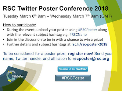
The hashtag #RSCposter is short for, “ Royal Society of Chemistry poster,” and it blew up on science Twitter this week. This was a seriously organized event , with rules as comprehensive as I’ve seen for some in person conferences. Organizer Edward Randviir explains (lightly edited): The goal of this is to provide a new innovative conferencing format that takes advantage of modern social media... We also wanted to gives presenters a free platform to present and discuss their work, and encourage particularly young researchers to participate in academic discourse to build their confidence. Twitter was the most appropriate social media platform. Many professionals across a range of sectors use Twitter for professional purposes, unlike Facebook or other social media outlets. Twitter limits the discussion to 280 characters, which challenges participants to be concise while communicating key messages from their work. This was the fourth time the Society had done this, but it was the first ...