Posts

Showing posts with the label posters on screens

Link roundup for July, 2018

Image
Paul Frankland compares the electronic poster session to the traditional paper poster session at the 11 th Federation Of European Neuroscience Societies (FENS) Forum of Neuroscience . Here are electronic posters: And here are the paper posters: I think this may be a “attendance vortex.” If the number of e-posters is small, there will be few people browsing no matter how good the posters are. People will go where there are people, which reinforces the poor attendance. Electronic posters were courtesy Morressier , according to Gemma . • • • • • You are going to have to click through to see the video of this poster from the lab of Prosanta Chakrabarty. It... spins. Like Wheel of Fortune spins. This serves no communicative purpose. But it is fun. Hat tip to Tidepool Ann. • • • • • The littlest poster presenter, at the International Congress for Neuroethology . Courtesy of Dr. Paloma . • • • • • Dr. Petra has a Twitter thread a...

Link roundup for July, 2018

Image
Starting off this month with a “Done in one” advice article on poster design by Tullio Rossi. I disagree with a few very minor points (bullet points are not your friend ), but overall very good! Hat tip to Anna Clemens .  • • • • • A five tweet thread from Tolpa Studies from the recent Twitter conference, #BTCon18, about visual literacy.  • • • • • This guide on making graphs more readable is very good. One of the key things in this graph makeover and why it works is the designer listened to what the scientists said about it . They used the expertise to defined the graph’s “talking points”, so to speak. Hat tip to Garr Reynolds.  • • • • • I recommend against tables on posters almost always. But if you must have a table, make it a nice table. This is a nice animated makeover of a table by Joey Cherderchuk from Dark Horse Analytics. Hat tip to Catherine Crompton  • • • • • Picture i...

#RSCposter 2018

Image
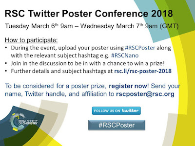
The hashtag #RSCposter is short for, “ Royal Society of Chemistry poster,” and it blew up on science Twitter this week. This was a seriously organized event , with rules as comprehensive as I’ve seen for some in person conferences. Organizer Edward Randviir explains (lightly edited): The goal of this is to provide a new innovative conferencing format that takes advantage of modern social media... We also wanted to gives presenters a free platform to present and discuss their work, and encourage particularly young researchers to participate in academic discourse to build their confidence. Twitter was the most appropriate social media platform. Many professionals across a range of sectors use Twitter for professional purposes, unlike Facebook or other social media outlets. Twitter limits the discussion to 280 characters, which challenges participants to be concise while communicating key messages from their work. This was the fourth time the Society had done this, but it was the first ...

Link round-up for November 2017

Image
The link roundup after the massive Neuroscience meeting is always fun. Just ask Shaena Montanari , “How big is that meeting?” Was at the bar tonight in DC and saw poster tubes... I’m not even a neuroscientist and I knew. #SfN17 With tens of thousands of posters, I find classics like this, from Steve Ramirez : Always check your dimensions before printing. I have written before about how people incorporated video into their poster demonstrations (QR codes, iPdas, etc.). But this is the first time I have seen anyone do a virtual reality (VR) demo at a poster: Advice from Caitlin Vanderweele: Convince your labmate to carry the poster tube. Justin Kiggins noted : Incredible how many posters at #SfN17 have "Preprint available at @biorxivpreprint" & a DOI/QR #asapbio Coffee & Science asked : Poster session didn’t go well? • • • • • Everything old is new again. Fabric posters have been done since the 17th century: The thesis of François Marescot, printed on silk, is on disp...

Link roundup for August 2017

Image
This month’s nominee for “Best poster ever” comes from the Ecological Society of America (ESA) meeting, and was created by Julian Resasco , with pictures by Andrew Bell : I got multiple people forwarding this to me, and saw many positive comments on Twitter, so this one is definitely a fan favourite. I am hoping Julian will submit this to the blog so we can talk about it in more detail later! Hat tip to Jacquelyn Gill , Michele Banks , and Megan Lynch . The ESA meeting also gave us a candidate for “best poster reuse”: Hat tip to Nathan Emery and the Ecological Society of America. Data is the Spotlight is a blog that does for figures what this one does for posters. Hat tip to Arjun Raj and Prachee Avasthi. Terry McGlynn makes an important point about conference scheduling , using the ESA meeting as an example : Many with “late-breaking” posters are stuck on Friday because they weren’t aware of the deadline, or didn’t have funding 6 months ago. Who is most likely to not get the heads...

What is the “ePoster” format?

Image
I’ve been predicting that we’re going to see a slow decline in paper posters for a while, so I was interested when John Coupland and Lady Scientist drew my attention to the joint annual meeting of (deep breath)... The American Society of Animal Science (ASAS) The American Dairy Science Association® (ADSA®) The Western Section of the American Society of Animal Science (WSASAS) The Canadian Society of Animal Science (CSAS) They are having presentations in an “ePoster” format. Their instructions are here . I can’t quite visualize this yet, but as near as I can tell, it is an illegitimate love child of a PowerPoint slide show and a paper poster. It’s the size of a poster (about 40 inches wide)... but you can have multiple screens of information, with hyperlinks and videos (like slides). The conference FAQ says: On average, presenters will normally have 3-­5 pages of content on their e-­posters. How is this different from a slide show? The conference organizers are squelching the “Click...

Link roundup for May 2016

Image
Matthew wins for best poster design cartoon this month: You can see more of his cartoons at Errant Science . His inspiration for this one? Just looked at a draft of a poster, there was text in size 2 point… Just to drive the point home, let me say: Writing text in a 2 point font on a poster is dumb. Do not do that. James Hamblin, writing for The Atlantic , has a fascinating article about using colour to increase the readbility of text . Here’s an example, where colour is used as a cue to tell you what the next line is: This specific example is from a company called BeeLine . They have plugins for Chrome for the web and PDFs. Here’s this blog viewed in Beeline: I haven’t had success with reading my PDF reprints in BeeLine colour yet. The Atlantic article suggests there are many more possibilities to improve the reading experience beyond what we have learned from the printed page. I would not recommend trying it for a poster quite yet, because the unfamiliarity might be confusing or ...