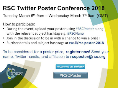
#RSCposter 2018
The hashtag #RSCposter is short for, “Royal Society of Chemistry poster,” and it blew up on science Twitter this week. This was a seriously organized event, with rules as comprehensive as I’ve seen for some in person conferences.
Organizer Edward Randviir explains (lightly edited):
The goal of this is to provide a new innovative conferencing format that takes advantage of modern social media... We also wanted to gives presenters a free platform to present and discuss their work, and encourage particularly young researchers to participate in academic discourse to build their confidence. Twitter was the most appropriate social media platform. Many professionals across a range of sectors use Twitter for professional purposes, unlike Facebook or other social media outlets. Twitter limits the discussion to 280 characters, which challenges participants to be concise while communicating key messages from their work.
This was the fourth time the Society had done this, but it was the first time I’d noticed. Edward explained that the first two years (2015, 2016) had about 80 people contributing (using the hashtag #RSCAnalyticalPoster). It expanded in 2017 to none areas of chemistry, and participation jumped to about 220 posters. “Following on from that success,” Edward continued, “we brought in chemical engineering this year. With help from several Royal Society of Chemistry journals, we have seen participation increase again by around 12%. We hope to grow the event further in the future.”
Tweeting posters presents its own particular problems. Twitter is a mobile phone app at heart (as much as Twitter tries to make it the “everything machine”), and mobile phones are small screens, not big poster boards. I was viewing posters on big desktop computer. Even with a fairly high resolution computer screen, I worried about whether people would dump posters meant to be printed 2 meters across into a tweet and that it would be too small to see.
Lucie Nurdin noticed one workaround:
Opening the poster into a new tab allows to zoom on it and have a high resolution image. Glad I figured that out!
To my surprise, most posters were readable. But alas, not all were. This poster by Jinchuan Yang, fell into the trap of not making the text big enough for a Tweet. Click to enlarge (or any subsequent poster).
Progyata Chakma mostly did okay on the right and middle columns, but some of the left hand text is too small to read.
This, from GKalqurashi, is another example of a poster that wasn’t readable on my desktop.
Most posters were readable on my desktop, although some were often barely so.
Another problem with tweeting a poster is that when you post an image on Twitter, it creates a preview image that is resized and cropped down. It used to be 440 × 220 pixels (a 2:1 aspect ratio) in landscape format (wider than tall). I’m not sure that’s still true, because I saw a lot of square preview images. And many people use clients other than Twitter.
Regardless, most posters I saw were not optimized for preview images. I saw lots of posters in portrait format (taller than wide), which no app I know uses for Twitter previews.
Because of the cropped previews, the poster’s title – the most important part of a poster – were often hidden. This problem was mitigated a little, because the tweet itself could serving the job the title usually does: to entice the passerby. (Or scrollerby, in this case).
Luke Wilkinson’s poster caught my eye by placing a cute robot right in the middle, where it will be seen despite how Twitter crops rectangular images. Placing it in a circle also helps break up the rectangle monotony that you get when faces with scrolling through lots of posters.
Yuanning Feng took advantage of the format to make an animated poster. This does not look as good here on the blog as the original tweet, because of the hoops I have to jump through to convert a *.gif posted to Twitter – which Twitter converts to a movie – back into a *.gif.
Feng’s animation seems to be getting him about three times as many “likes” as most posters.
But as of now, it seems one of the most popular posters was by Jo-Han Ng. (And once you visit that, check Errant Science’s riff on Ng’s poster!)
As I scrolled through #RSCposter, my overall impression was, “Oh, there are all the problems that I usually see on academic posters. Too much to read. Too many boxes, not enough white space. Photo backgrounds that make the main stuff hard to read. Colour overlead.”
“New bottles for old wine,” as the saying goes.
External links
Take part in a truly global scientific conference
RSC Twitter Poster Conference 2018


Comments
Post a Comment