Critique and makeover: Snake bite
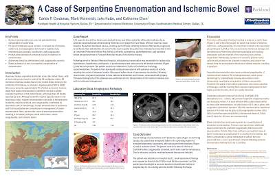
Today’s poster comes to us courtesy of Catherine Chen, who was kind enough to share. Click to enlarge!
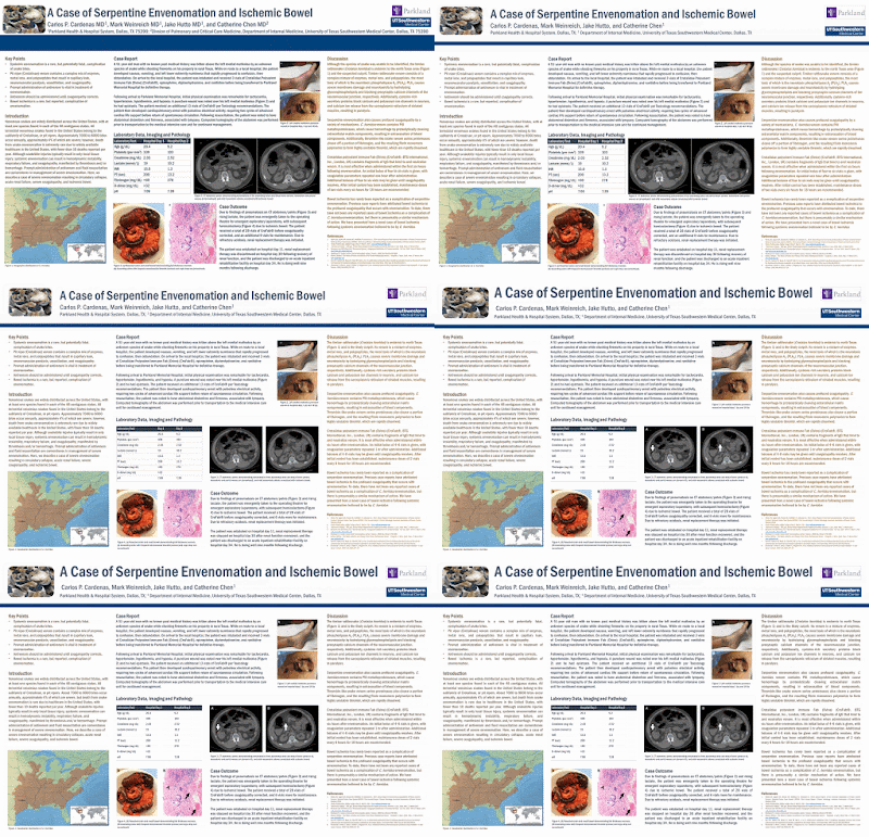
Catherine supplied this in an editable file, so the easiest way to go through this critique is to show how this poster could change.
The first thing that jumped out when I opened up the file is that title area. The longer I write this blog, the more interested I am in the titles of posters and how they are presented. Titles are just critically important. As I wrote last week (and before), nothing should compete with the title.
Here, your eye is drawn to that big blue band running across the top, and not the title. It is arguably the most optically dominant thing on the entire poster. I kind of like the idea of the bar as a separator, but it needs to be smaller, opening up the space around the title.
In addition to shrinking the bar, I made other, less obvious tweaks.
I shortened up the institutional addresses. Will anyone need a zip code while viewing a poster? Rather than footnotes leading to institutional addresses every author, I just had one for the single person who was different than the others. The result is more white space that clearly separates the logos from everything else.
Speaking of the logos, I added a thin blue line around the top “Parkland” logo so that it was more clearly a rectangle. Now, it becomes more obvious when the two logos are the same width.
Next, I continued creating space. This poster has so much text that it looks like a manuscript draft rather than a poster. When I have the chance to do a makeover, I always try to preserve the original style of the poster, so I didn’t edit the text much.
The effect of so much text was made worse because everything was pushed far too close. I selected “View grid,” set a grid for one inch. Then I made sure everything was an inch from anything else. That is:
At this point, I realized that some of the figures had arrow in them. I literally had not noticed them until I zoomed in for some other reason, which tells you those are too innocuous. The ones over the right hand images were were so low contrast (dark brown over black) that they were practically camouflaged. I made those white, and made them bigger.
I also added the “A” and “B” to the black figures on the right. I harmonized all the figure labels, making them the same font (Franklin Gothic Medium Condensed) as the rest of the text.
I also took out a lot of lines in the table.
I still wasn’t done with that title, though. I didn’t like that there was so much unused space at the top. I upped the ante, and made it even bigger.
I also tweaked the spacing so the top of the letters in the title were aligned with the images on either side. The automatic “snap to grid” doesn’t always do it correctly, so sometimes you have to do it by eye.
I did a little editing to make the left column fit more comfortably in its space. I also made the text in the right column the same colour as the left.
I also tried the poster with the text justified.
The difference isn’t large, but it does emphasize that items are squared up in a way they weren’t before.
Here’s the transformation in animated form! Hopefully, this makes the impact of the changes easier to see.
Catherine supplied this in an editable file, so the easiest way to go through this critique is to show how this poster could change.
The first thing that jumped out when I opened up the file is that title area. The longer I write this blog, the more interested I am in the titles of posters and how they are presented. Titles are just critically important. As I wrote last week (and before), nothing should compete with the title.
Here, your eye is drawn to that big blue band running across the top, and not the title. It is arguably the most optically dominant thing on the entire poster. I kind of like the idea of the bar as a separator, but it needs to be smaller, opening up the space around the title.
In addition to shrinking the bar, I made other, less obvious tweaks.
I shortened up the institutional addresses. Will anyone need a zip code while viewing a poster? Rather than footnotes leading to institutional addresses every author, I just had one for the single person who was different than the others. The result is more white space that clearly separates the logos from everything else.
Speaking of the logos, I added a thin blue line around the top “Parkland” logo so that it was more clearly a rectangle. Now, it becomes more obvious when the two logos are the same width.
Next, I continued creating space. This poster has so much text that it looks like a manuscript draft rather than a poster. When I have the chance to do a makeover, I always try to preserve the original style of the poster, so I didn’t edit the text much.
The effect of so much text was made worse because everything was pushed far too close. I selected “View grid,” set a grid for one inch. Then I made sure everything was an inch from anything else. That is:
- The text is an inch from the margin.
- The columns have an inch between each of them.
- The figures have an inch of white space left, right, top and bottom. Exception: when two pictures are parts of a single figure.Then you want them to be closer to indicate visually that they belong together.
At this point, I realized that some of the figures had arrow in them. I literally had not noticed them until I zoomed in for some other reason, which tells you those are too innocuous. The ones over the right hand images were were so low contrast (dark brown over black) that they were practically camouflaged. I made those white, and made them bigger.
I also added the “A” and “B” to the black figures on the right. I harmonized all the figure labels, making them the same font (Franklin Gothic Medium Condensed) as the rest of the text.
I also took out a lot of lines in the table.
I still wasn’t done with that title, though. I didn’t like that there was so much unused space at the top. I upped the ante, and made it even bigger.
I also tweaked the spacing so the top of the letters in the title were aligned with the images on either side. The automatic “snap to grid” doesn’t always do it correctly, so sometimes you have to do it by eye.
I did a little editing to make the left column fit more comfortably in its space. I also made the text in the right column the same colour as the left.
I also tried the poster with the text justified.
The difference isn’t large, but it does emphasize that items are squared up in a way they weren’t before.
Here’s the transformation in animated form! Hopefully, this makes the impact of the changes easier to see.


Comments
Post a Comment